Posts

Shadow and Bone: Season 2

 Since we're still not having class, and the new season of the Netflix show Shadow and Bone  came out yesterday, I'm going to write about that. I think it's absolutely awesome. While the plot doesn't exactly follow the books, it's still super enjoyable, and really nice for fans of the book series to see their favorite scenes played out on screen from a cast they love. The costuming and set design is even more stepped up from the first season, making you feel like you're completely immersed in the world of the story.  The digital effects have even been brought up a notch, especially with the effects showing the light powers from the main character. In the first season we don't get to see much of what the character has to offer through her power, but this season, as she has come into her own, we see her power manifested in a really fantastical way that looks even cooler than the previous season. The villain's powers have also been boosted, as his own power...
Cocaine Bear

     Although we aren't having class this week, I still figured I would write some entries here for this week. During my spring break, I'd say the most interesting thing I did was watch Cocaine Bear, which was freaking awesome. While it wasn't like an Oscar winning, cinematic recipe for the ages, I thought it was a masterpiece in its own way. Even if it's based on a true story, a bear on cocaine is just the best idea in the world and I can't believe it hadn't been made sooner.       In terms of digital effects, it wasn't really anything special. The gore and the actions of the bear were pretty cheesy and what you would expect from a movie like Cocaine Bear, but honestly that made it even better. At the end of the day the mother and kids live happily ever after, and you get to leave the theater with the story from when you watched Cocaine Bear, so I think it's a win-win scenario for the characters and the audience.  Final Rating: 100000000/10

Midterm Update

 I just complied and compressed all my files from this first half of the semester (I hope I compressed them right), and just wanted to update on how the semester has gone so far. I honestly didn't quite know what to expect starting this class this year, but I am really proud of what I have been able to accomplish with my projects so far, especially in Photoshop. We started with Midjourney, which is incredibly fun to use, and I never would have found out about about a resource like that if I hadn't been in this class. It took a minute to get the hang of it at first, but now I have a really good understanding of what keywords I need to use within the prompts to get what I want, as well as how to change the orientation or the quality of the photo. Then we started using Photoshop, which when we started I really thought I was never going to be able to use it because it was so complicated. But, as we did projects with it and were able to practice with the program, it became much easi...

Illustrator Portrait and Landscape

 Our homework for this weekend was to create an image of a landscape and a portrait in Illustrator. It was... definitely something. Very frustrating. Very anger-inducing. I thought that the portrait was a lot easier to create than the landscape, partially because the picture of Taylor Swift I used had more set shapes than the landscape.  For the landscape image, I used a picture of a formation from Red Rock Park, but I think the scraggly formation of the rocks and all the different shades of colors made it even harder to trace the image and paint it. Even trying to paint in the different shapes proved difficult, because when I tried to use the paint brush tool, it would only let me use like two different brushes that didn't work for what I needed, and the size of the brush wouldn't change either, so the painted parts just didn't end up how I wanted them.  I tried a few different methods of creating the image, included the trace tool, but it really didn't work how I need...

Digital Media Interaction

Image
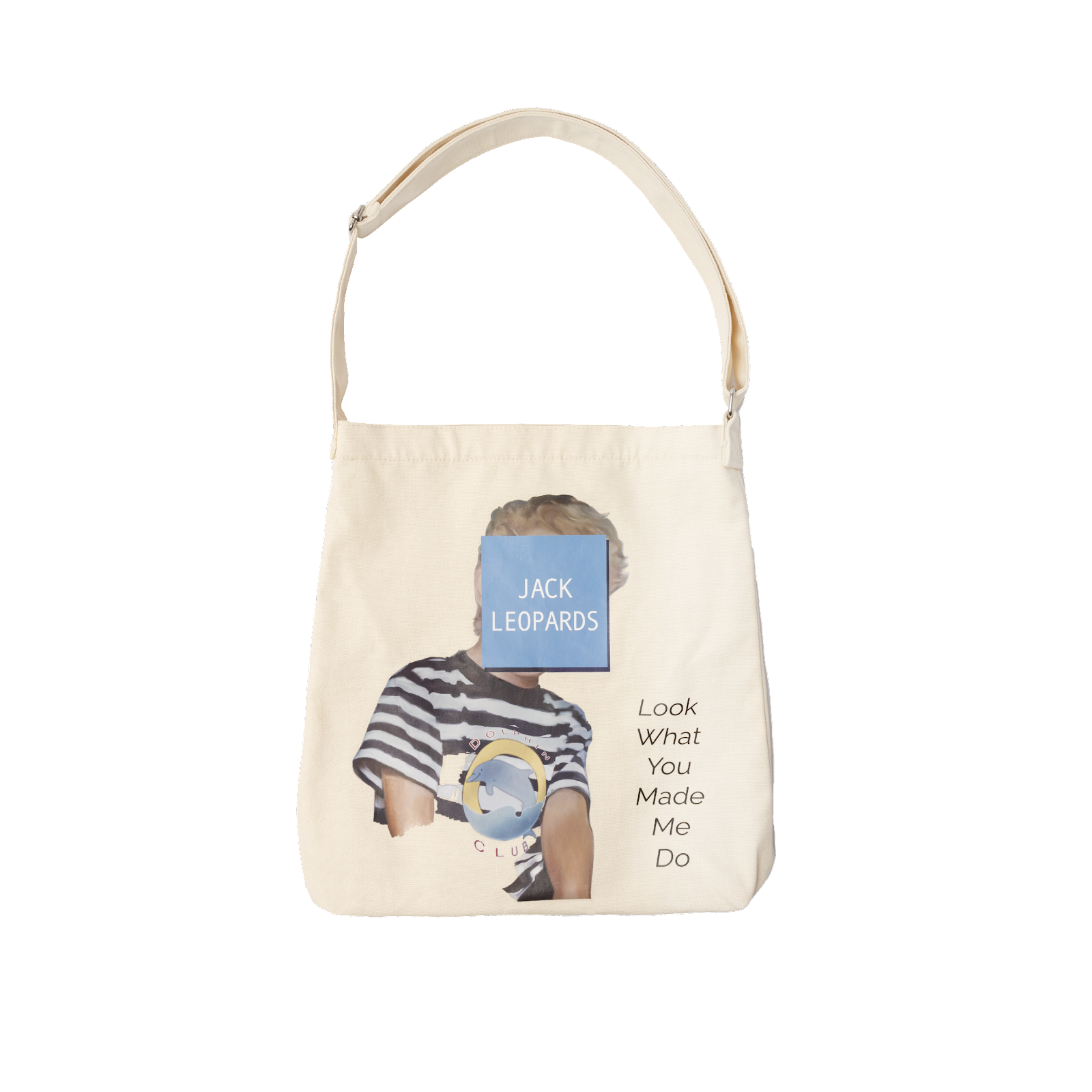
 This post doesn't have much to do with the class, but when we started these it was mentioned that we could write about anything concerning digital media, and I realized the other day that I owned something that I hadn't looked at in a while that I thought was interesting. I ordered this tot bag a while ago, and just now got a really good look at the design on it. This is the bag:  I thought of this bag and design to write about because now that I have some experience in Photoshop, I can see all the pieces the designer put together to made the finished product. For example, in the first layer they probably would have cut out the image of the boy, and then added the shadow of the blue square in the second layer. Then, they would've added the blue box in another layer, and the text on top of it. Lastly, they would have cut the dolphin image out and added on top of the boy's shirt in another layer. One thing about the design that I'm not a huge fan of is the text on th...

Intro to Illustrator

 Today we started using Illustrator and it's so much more fun than Photoshop. Photoshop sucks lowkey. Obviously, it'll take some time to get used to, but Illustrator is already so much easier to understand, although there were some tools that were just not working for me. For example, I literally couldn't get the blend shape tool to work,  OR the curvy text tool, so I'm going to have to play around with that. I can't paste what I made in class, but it felt very Minecraft inspired. Just very simple shapes. I am excited to work on our assignments for next week, though I do think the portrait might be a bit of a challenge. 

2nd Photoshop Assignment

Image
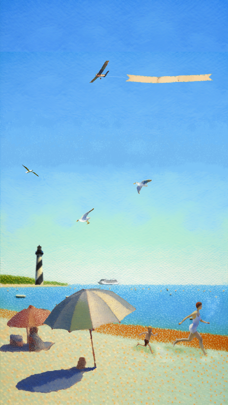
 Fake Art: ✅  As I looked at Seurat's different pieces, I noticed that a lot of them had bodies of water in them. "A Day at the Park" has people next to a lake, and "Bathers at Asnières" has people in front of another pond. I decided that I would create a image of a kind of picture I would take of Hollywood Beach, my hometown beach, and parts of St. Augustine, most notably the lighthouse. This was my final image:  I really like how it turned out, and I think I did a really good job of adding the different elements together into one cohesive piece. When you're starting at it as you work on it, you tend to notice each individual piece, but looking at it after you've closed it makes it look much more put together.  I added the cruise ship and the plane with the banner attached because you always see those at Hollywood beach, and the lighthouse, seagulls, and parent/child running seemed like more of the laid back vibe that you feel in St. Augustine. I also h...